Oh if shears and rotary cutters and pins and needles could speak, what an exotic tale they would tell, divulging all the secrets of the intriguing world of commission quilting! Humor me here, will you?
OK, so making a quilt for a client may not be that exotic, but it does come with its own idiosyncrasies. And today I’ll start walking you through that journey with me, as I make a quilt for a commercial client.
But first, I’ll give you another peek at two other commissions, both for private clients.
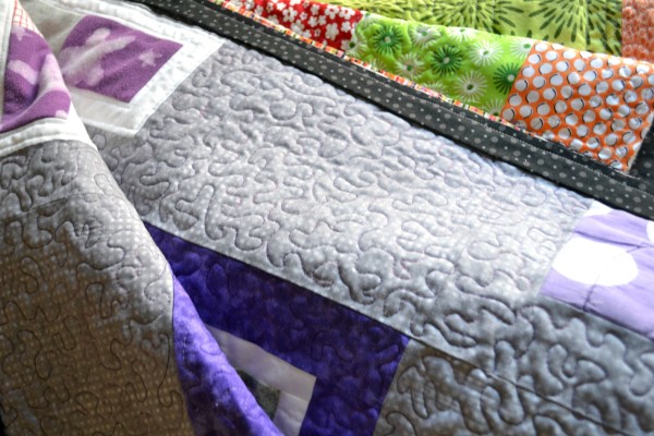
First up is the memory quilt for a mother whose son is away at boarding school. I made a quilt for him that she loved so much she decided to commission one for herself. His was made for the wall, but hers is for napping under, so I made it 60” x 60” (square just fit the feel of the design better than rectangular did). I’m on the final stage of this one - I only have the binding to hand sew down around the perimeter of the quilt. It’s my favorite part of quilting, so I’m really looking forward to the pleasure of sitting down to finish it.
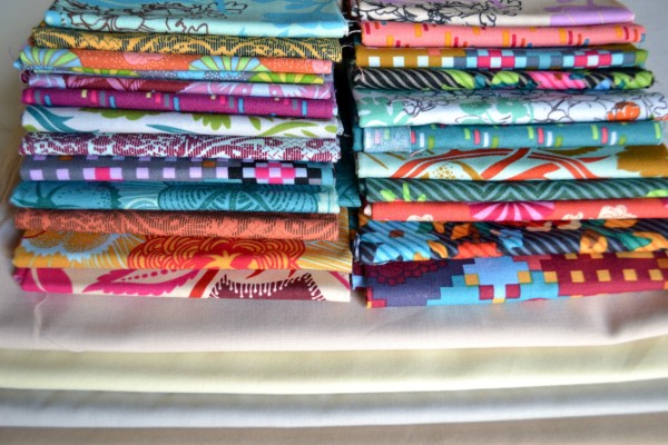
In addition to finishing up the memory quilt, I’m getting started on another private commission job this weekend. This one is for someone’s 50th birthday, commissioned by her husband. After working on the memory quilt the last several weeks and puzzling over unique layouts and incorporating different fabrics, patterns, and colors, I’m really excited to work on this job, which is a lot more straightforward (read: a lot less mentally intense).
I’m using a fabric collection from AnnaMaria Horner along with a selection of solids to ground all those wild patterns, as well as give it some visual depth (that’s the reason I’m using multiple solids and not just one). The pattern I’ve chosen showcases those gorgeously lush prints and really allows them to shine. My client (the husband) has given me free reign on the colors and design, so it will be fun to watch this come together.
My deadline is November 17 so I’ll be busily sewing next week, and I’ll show you my progress then.
And now for the commercial job. As I mentioned last week, the client (an interior design/architecture firm) has commissioned a quilt for the wall of a new restaurant that’s opening in Northern Virginia. They asked for a modern version of a 13-star American flag.
When conceptualizing the job, I envisioned using deep navy blues, rusty reds, and a range of ivories, because these were the colors in the picture of the inspiration quilt they sent over. I wasn’t sure about how I’d piece the job, however I did want to incorporate movement into the stars on the field of blue.
When I initially shopped for a few fabric samples to show the client, I had a hard time finding the darker-toned fabrics I had in mind. But as I pulled the pre-cut pieces that JoAnns had (I didn’t want to commit to a lot of any particular fabric or significant expense yet), the colors I grabbed were considerably brighter than what I had in mind.
But then I realized that that was OK, in fact, I embraced it - it gave the flag a more modern feel, which is what they wanted. I had a jump start on the fabric, and was thrilled about that.
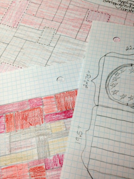
I spent several hours last Sunday sketching out the quilt and working the math for construction. The biggest difficulty was calculating exactly how big each of the stripes had to be in order to meet their required dimensions - 42” x 66”.
Because this quilt is being hung in a recessed frame that’s being designed and built into the wall of the restaurant, the end measurements of the quilt have to be spot-on. Thus, the reason I spent many hours and multiple calculations of scale and proportion and construction requirements.
After I was fairly confident in my measurements, I worked on sketching out my construction plan.
My vision was to construct the red and white stripes, as well as the field of blue, using an improvisational slab technique. I plan to chain piece strips of each color, with each strip using different lengths and widths. Then I’d cut chunks from each strip and chain piece those to get an improvisational stripe the size I need.
My plan for quilting is to appliqué a variety of sizes of rectangles and squares on top of the improvisational pieced stripes. These appliqués will overlap slightly onto the next stripe (so some of the red appliqués will overlap onto the white stripes, and vice-versa). The client, when reviewing my portfolio images, said they liked my appliqué work, and it’s a technique that I love to do, so I decided to play to my strengths and go that route.
Last Monday I typed up my plans, scanned my sketches, and emailed them to the client. She replied very quickly, much to my delight.
The first big issue that came up was that the flag is going to be hung vertically, which isn’t what I had in mind whatsoever (the client hadn’t specified that fact until that point). Which isn’t a problem of course, but it’s always a bit of a shock when the picture in your head differs drastically from what’s required. But I’m very glad I found out that little detail sooner rather than later, since it significantly affects the construction of the stars on the blue field.
The client didn’t really comment on my construction plan or my quilting plan, which I took as a good sign. She did however express concern that some of the fabrics I showed weren’t modern enough. She said if the piece had to err on one side, it should lean more toward looking more modern than traditional.
Yikes, this threw me for a bit of a loop! Because no matter how much positive (or neutral) feedback you get, it’s hard not to ruminate on the negative (at least for me it is).
Which in defense of the client, wasn’t even negative. She merely “expressed concern.” And she followed it up with “but I trust your artistic vision on this” which is a statement that’s worth its weight in gold.
But still, I was freaking a little, truth be told. I lost a bit of confidence right there.
(I totally should not be admitting that, but whatever. It’s the truth.)
So I let it sit for a bit, thought for a while, and decided that maybe I could “modern it up” by incorporating more solids, rather than all prints as I’d initially planned. Solids almost always lend a more modern feel to things. I emailed her back my revised plan but didn’t get any response, which I took as a go-ahead.
(Let’s hope I don’t regret that move.)
On Thursday of this week I set off to purchase fabrics. I needed a selection of red solids and modern red prints, a selection of blue solids and modern blue prints, and a selection of white/off-white/natural solids and prints, as well as backing fabric.
I trekked out to G Street Fabrics in Rockville because I had a Living Social certificate that was due to expire next week. Good move, right?
Not so much.
It took me over an hour to get there, even in the middle of the day (it should take about 30 minutes but there was a big traffic backup getting over the Potomac River). So strike one.
They had practically no solid cotton fabric, and zero in red or blue. Seriously, what gives with that?!? Strike two.
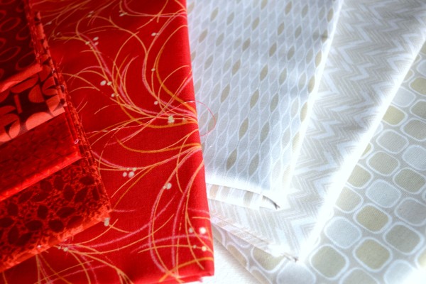
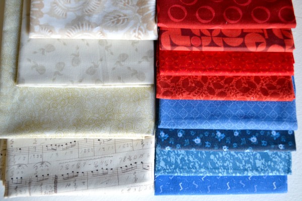
They did, however, have this series of low-volume fabrics from PB Textiles that had modern prints using white with shades of natural and gray, in varying patterns. I picked up three different ones, one that I’ll use for the back of the quilt.
As for the blue and red prints, they only had one, ONE, that I thought would fit my vision. So I picked up only one piece of red fabric. Strike three.
It took me over an hour to get home, since now it was rush hour. So the horrible drive and the fact the selection was so slim has me thinking that might be my last trip to G Street Fabrics.
But on the bright side, those low volume white tonal prints are serving as inspiration for the rest of the white stripes, which I think will vastly increase the modern quality of the quilt.
I still needed to get the rest of the construction fabrics though - the remaining whites/naturals, reds and blues. Because getting the right range of solids was my highest priority, I decided to make the trek out to Web Fabrics, which is 45 minutes away (uggghhhh). And thankfully they didn’t disappoint.
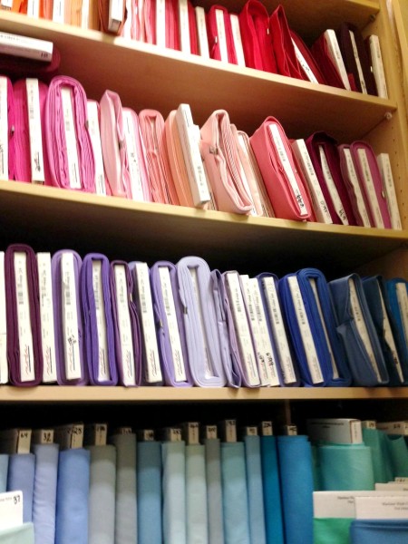
I definitely learned my lesson in this process. Web Fabrics, which is a dedicated quilting store, had everything I needed and more. There were so many gorgeous fabrics in a whole range of tones, the exact range I was looking for to give the piece depth. And really, the employees could not have been more accommodating to me pulling fabrics, stacking them up, adding a few, subtracting a few, shuffling them around, etc. I may have annoyed a few customers in the process too (that place is cramped, it’s absolutely stuffed with bolts of fabric) but even they were gracious (at least to my face).
The woman cutting my fabric even tried to help me make the most of my budget, suggesting different cuts and brands of various fabrics to be the most economical. But she was quick to add “But only you know if it works with your color story.”
My color story - YES, that was it, exactly. I finally felt like this quilt was coming together the way I wanted it to. It’s the flag, after all, so it has to be red, white and blue. And the specification are the clients.
But the story? That’s all mine, and it was a thrilling and very valuable revelation.
One that was worth every bit of the 45-minute drive out there.
I’ll have the next installment on the alluring world of commission quilting (because traffic jams are glamorous, right?!?) next week, so be sure to stop back!

